The Psychology of Color in Branding Digital Products

7 days ago
The Psychology of Color in Branding Digital Products Image

When designing a digital product experience and its interface, the goal is to create an aesthetic that effectively communicates the desired message on both a visual and psychological level. For this reason, color decisions made upfront can either enhance or detract from other app design decisions and contribute to the overall success of your digital product.

With a practically unlimited gamut of colors available, it might seem that it would be difficult to know where to start when deciding upon color in app design. However, some considerations can help a designer pinpoint exactly which colors will elicit desired responses from their users and ultimately contribute to a successful digital product.

The Basics of Color Psychology

Color is a powerful tool in digital product design, influencing user emotions, behaviors, and perceptions. Understanding the basics of color psychology is crucial for creating effective and engaging digital experiences.

How Colors Affect Human Emotions & Behavior

Colors have a profound impact on human psychology, evoking specific emotions and influencing behavior. Research shows that up to 90% of product assessment is based on color alone, highlighting its critical role in shaping user impressions and decisions.

  1. Emotional responses: Different colors can evoke distinct emotions. For example, blue often instills trust and calmness, while red can create excitement or urgency.
  2. Physiological reactions: Colors can trigger physical responses. For instance, red can increase heart rate and create a sense of urgency, while blue can have a calming effect.
  3. Attention and focus: Warm colors like red and orange naturally draw the eye, making them useful for highlighting important elements or calls to action.

Color in Digital Products: From UI to UX

In user interface (UI) design, color is a silent guide. It creates visual hierarchies, drawing attention to important elements like call-to-action buttons or key information.

But color’s role extends beyond the surface level of UI into the deeper realm of user experience (UX). Here, color choices can reduce cognitive load by grouping related information or distinguishing between different types of content. 

Colors can guide users through a desired flow of actions, provide feedback on user interactions, and even influence the perceived personality of a digital product.

In the end, color in digital design is about communication. It’s about using this powerful, silent language to speak directly to users’ emotions and needs, inform usability, and create experiences that resonate on a deeper level than words alone can achieve.

Key Color Psychology in Digital Branding

Red

Netflix logomark: Stylized red 'N' with curved edge on a black background.

Red, a primary color of unparalleled intensity, commands attention and ignites strong emotions. It pulses with energy, action, and passion, evoking associations ranging from love and desire to danger and excitement. Red’s power lies in its ability to quicken pulse rates and create a sense of urgency.

In the realm of digital products, red’s bold presence can be leveraged to create impactful, emotion-driven experiences. Its ability to grab attention and provoke immediate responses makes it particularly potent in user interfaces and branding strategies.

Red excels in:

  • Creating urgency: Its association with alertness makes it ideal for notifications, alerts, or time-sensitive data and offers.
  • Highlighting key elements: Red naturally draws the eye, perfect for important buttons or focal points in a design.
  • Evoking excitement: For entertainment or gaming platforms, red can amplify the thrill and engagement factor.
  • Building brand recognition: As a memorable and impactful color, red can forge strong brand identities.
  • Stimulating appetite: Useful for food delivery apps or culinary-focused digital products.

Red ignites digital interfaces with passion and intensity. Netflix harnesses this power, transforming streaming into a thrilling adventure. The bold red palette fuels anticipation, sparks binge-worthy excitement, and amplifies storytelling drama. Netflix doesn’t merely offer content—it creates an immersive world of narratives, inviting users to dive deep into captivating tales. In the competitive streaming landscape, Netflix’s red isn’t just a color choice—it’s an emotional catalyst, embodying the very essence of entertainment and cinematic allure.

Orange

SoundCloud logo: Orange cloud shape with rounded edges, above text.

Drawing from its parent colors of red and yellow, orange exudes energy, positivity, and a sense of adventure and rejuvenation. Orange nods to natural moments—a colorful sunset, changing leaves, or fresh fruit. Its playful and youthful connotations are hard to escape, which leaves it feeling less conventional than other color options in certain contexts.

However, this unconventional nature is precisely what makes orange a powerful choice for brands looking to stand out and make a bold statement. Its vibrant personality can be leveraged to great effect in digital products aiming to convey enthusiasm, creativity, and approachability. 

Orange is particularly effective in:

  • Encouraging action: Its energetic quality makes it excellent for call-to-action buttons or elements that require user engagement.
  • Promoting social interaction: The warmth of orange can foster a sense of community and openness in social apps or platforms.
  • Highlighting innovation: For tech products or services that want to emphasize their cutting-edge nature, orange can signal forward-thinking and originality.
  • Appealing to younger demographics: Its youthful associations make it ideal for products targeting millennials or Gen Z.
  • Creating a sense of affordability: Orange can convey good value, making it useful for e-commerce or budget-friendly services.

Orange is a color that has the power to enhance digital interfaces. SoundCloud effectively leverages the vibrant energy of its orange color to ignite creativity and foster community connections. This distinctive approach sets SoundCloud apart from its competitors, transforming the act of streaming music into an exhilarating adventure that perfectly encapsulates the essence of musical exploration.

Yellow

Snapchat logomark: White ghost shape on yellow background.

Yellow, the brightest hue in the visible spectrum, radiates with the warmth and energy of the sun itself. This vibrant color embodies optimism, creativity, and clarity, evoking feelings of cheerfulness and vitality. In the digital landscape, yellow’s dynamic nature offers a powerful tool for brands seeking to convey positivity, innovation, and attention-grabbing impact.

In digital product design, yellow’s versatility allows it to inject energy and enthusiasm into interfaces while maintaining clarity and focus. Its ability to stimulate both the mind and emotions makes it particularly effective in creating user experiences that feel engaging, uplifting, and mentally stimulating.

Yellow excels in:

  • Capturing attention: Its high visibility makes it ideal for important notifications or calls to action.
  • Promoting optimism: Yellow can create a positive user experience, perfect for motivational or lifestyle apps.
  • Stimulating mental activity: Useful for educational platforms, brainstorming tools, or productivity apps.
  • Enhancing readability: When used correctly, yellow can improve the legibility of text on dark backgrounds.
  • Creating visual interest: A splash of yellow can enliven otherwise muted color schemes.

Yellow electrifies digital spaces with vibrant energy. Snapchat’s bright branding exemplifies this, pulsating with youthful spirit and creative expression. It sparks playfulness, energizes social interactions, and celebrates the joy of fleeting moments. Snapchat doesn’t just enable messaging—it cultivates a dynamic platform for self-expression, inviting users to embrace spontaneity and digital creativity. In the fast-paced world of social media, Snapchat’s yellow isn’t merely visible—it’s visceral, capturing the essence of in-the-moment communication and the thrill of living unfiltered.

Green

Spotify logo: White text on a green background next to white circle with three lines.

Green, nature’s dominant hue, draws its harmonious essence from the vibrancy of yellow and the serenity of blue. This versatile color embodies growth, renewal, and abundance, evoking the lushness of forests and the promise of new beginnings. In the digital landscape, green’s multifaceted character offers a powerful tool for brands aiming to convey sustainability, health, wealth, or natural harmony.

In digital product design, green’s adaptability allows it to thrive in various contexts while maintaining its core associations with positivity and balance. Its ability to simultaneously calm and invigorate makes it particularly effective in creating user experiences that feel both fresh and familiar.

Green excels in:

  • Promoting eco-friendliness: Its strong association with nature makes it ideal for sustainability-focused apps or environmentally conscious brands.
  • Encouraging financial growth: Green’s link to money makes it effective for finance apps, investment platforms, or e-commerce sites.
  • Enhancing well-being: Useful for health, fitness, or wellness apps, as green evokes feelings of vitality and balance.
  • Improving readability: Light green backgrounds can reduce eye strain and create a soothing reading environment.
  • Signaling safety and permission: Green’s universal association with “go” makes it perfect for confirming actions or indicating system status.

Green infuses digital interfaces with vitality and harmony. Spotify’s vibrant green embodies the power of musical exploration and growth, fueling creative discovery and seamless listening experiences. It sets Spotify apart by transforming music streaming into a journey of constant renewal and personal curation. Through green, Spotify cultivates musical landscapes, nurtures artistic growth, and invites users to explore an ever-expanding universe of sound.

Blue

Facebook blue lowercase logotype.

Blue, the color of vast skies and deep oceans, embodies trust, stability, and tranquility. Its calming presence and universal appeal have made it a go-to choice in design, sometimes to the point of overuse. However, blue’s versatility and psychological impact make it an enduring powerhouse in the digital product landscape.

In the realm of digital branding, blue’s strength lies in its ability to convey professionalism and reliability while maintaining a sense of approachability. Its cool tones can create a sense of depth and expansiveness in user interfaces, offering a canvas for both simplicity and complexity.

Blue excels in:

  • Building trust: Its association with dependability makes it ideal for financial, healthcare, or security-focused apps.
  • Enhancing readability: Light blue backgrounds can improve text legibility and reduce eye strain.
  • Promoting productivity: Cooler blue tones can aid focus and efficiency in work-related tools.
  • Creating a sense of space: Blue can make interfaces feel more open and less cluttered.
  • Evoking calmness: Useful for meditation, sleep, or wellness apps.

When harnessed skillfully, blue infuses digital interfaces with a sense of reliability and depth. Facebook’s iconic blue exemplifies this power, creating a familiar and trustworthy environment for social connections. It fosters a sense of community, encourages open communication, and provides a stable backdrop for diverse content. This thoughtful choice sets Facebook apart, transforming social networking into a dependable daily ritual. Through blue, Facebook doesn’t just connect people—it cultivates trust, facilitates sharing, and invites users to navigate a vast social landscape. In the ever-evolving world of social media, where trust is paramount, Facebook’s blue isn’t just seen—it’s felt, capturing the essence of reliable, global connectivity.

Purple

Twitch logomark: White speech bubble with black rectangular cutout on a purple background.

Purple, a regal blend of fiery red and calming blue, exudes an air of mystery, luxury, and spiritual depth. This complex hue bridges the gap between warm and cool colors, embodying both the confidence of red and the assurance of blue. In the digital realm, purple’s unique character offers a potent tool for brands seeking to convey sophistication, creativity, and a touch of the extraordinary.

In digital product design, purple’s versatility allows it to adapt to various contexts while maintaining its air of distinction. Its ability to evoke both excitement and tranquility makes it particularly effective in creating immersive and emotionally resonant user experiences.

Purple excels in:

  • Conveying premium quality: Its association with luxury makes it ideal for high-end products or exclusive services.
  • Stimulating creativity: Purple can inspire imaginative thinking, perfect for design tools or creative platforms.
  • Enhancing mystique: Useful for apps dealing with astrology, spirituality, or esoteric subjects.
  • Balancing energy levels: Purple can create a sense of calm excitement, which is beneficial for meditation or mindfulness apps.
  • Differentiating brands: In a sea of blue and red logos, purple offers a distinctive alternative.

Purple transforms digital interfaces into places of imagination and prestige. Twitch’s vibrant purple color fosters creativity, community, and real-time interaction. It distinguishes Twitch and elevates the gaming and live content experience. Purple embodies the essence of live, interactive entertainment and shared experiences in the digital realm.

Pink

Lyft logo in white on a pink background.

Pink, a soft blend of red and white, embodies delicacy, youth, and nurturing warmth. This charming hue radiates playfulness and good health while also evoking deep feelings of harmony and friendship. In the digital landscape, pink’s versatile character offers a powerful tool for brands seeking to convey approachability, care, and a touch of romance, all while challenging traditional color stereotypes.

In digital product design, pink’s adaptability allows it to thrive in various contexts, from playful apps to sophisticated interfaces. Its ability to evoke both gentleness and vibrancy makes it particularly effective in creating user experiences that feel inviting, fresh, and emotionally resonant.

Pink excels in:

  • Promoting inclusivity: Its evolving associations make it ideal for brands targeting diverse audiences.
  • Enhancing approachability: Pink can soften interfaces, making complex tools or services feel more accessible.
  • Conveying care and support: Useful for health, wellness, or community-focused apps.
  • Stimulating creativity: Light pinks can inspire imaginative thinking, perfect for design tools or artistic platforms.
  • Creating visual interest: In a sea of blue and green interfaces, pink offers a refreshing alternative.

Lyft’s pink color isn’t just a visual choice in the digital world. It creates a warm and friendly feeling, encouraging social interaction and connecting people. This bold color stands out in the competitive ride-hailing app market and embodies an inclusive and welcoming urban travel experience.

Black

Uber logo: White uppercase text on black background. Custom rounded font.

Black, the absence of visible color, has a unique power in its depth and versatility. This bold hue embodies contrasting concepts—from sophistication and luxury to mystery and the unknown. In the digital landscape, black’s multifaceted nature offers a potent tool for brands aiming to convey strength, elegance, or cutting-edge modernity while also carrying the potential to evoke more somber or intense emotions.

In digital product design, black’s adaptability allows it to create striking visual impacts and set distinct tones. Its ability to both recede and dominate makes it particularly effective in crafting user experiences that feel sleek, powerful, and immersive.

Black excels in:

  • Creating contrast: Its stark nature makes it ideal for improving readability and highlighting key elements.
  • Conveying luxury: Black’s association with sophistication makes it perfect for premium or high-end digital products.
  • Enhancing focus: Black backgrounds can reduce distractions, which is beneficial for productivity or content-focused apps.
  • Evoking mystery: Useful for entertainment platforms, especially those dealing with thriller or noir genres.
  • Signaling power and authority: Effective for professional tools or platforms targeting executive users.

Black lends sophistication and refinement to digital spaces. Uber strategically employs this in its app, conveying efficiency and exclusivity. This choice communicates reliability while creating an atmosphere of professionalism in ride-hailing. Uber transcends basic transportation services, instilling confidence and modernizing mobility for users navigating urban landscapes. In the competitive transportation app market, Uber’s use of black isn’t just a design choice—it’s a powerful brand statement, encapsulating refined, on-demand urban transit.

White

Google search homepage: White background with colorful Google logo above a rectangular search bar. 'Google Search' and 'I'm Feeling Lucky' buttons below.

White, the color of light, embodies purity, openness, and new beginnings. This pristine hue radiates clarity, peace, and infinite possibility while also carrying the potential for a sense of sterility or emptiness if not balanced properly. In the digital landscape, white’s expansive nature offers a powerful tool for brands aiming to convey cleanliness, simplicity, and a fresh start while providing a blank canvas for other elements to shine.

In digital product design, white’s versatility allows it to create a sense of spaciousness and clarity. Its ability to enhance readability and highlight other elements makes it particularly effective in crafting user experiences that feel clean, organized, and easy to navigate.

White excels in:

  • Maximizing readability: Its high contrast with dark text makes it ideal for content-heavy platforms.
  • Creating visual breathing room: White space can reduce cognitive load and improve user focus.
  • Conveying modernity: A minimalist white interface often suggests cutting-edge design.
  • Enhancing other colors: White backgrounds allow other hues to pop, useful for showcasing products or artwork.
  • Projecting professionalism: White can create a sense of efficiency and competence in business-oriented apps.

Google’s white search page is like a fresh sheet of paper, ready for your ideas. It’s clean, simple, and puts your search front and center. There are no distractions here; it’s just you and the world’s information at your fingertips. In a web full of noise, Google’s white space is a breath of fresh air. It’s not just a color choice—it’s an invitation to explore, learn, and discover without limits.

Brown

Etsy homepage: Woman arranging flowers by handmade pottery. Text: 'There's a person behind every piece'.

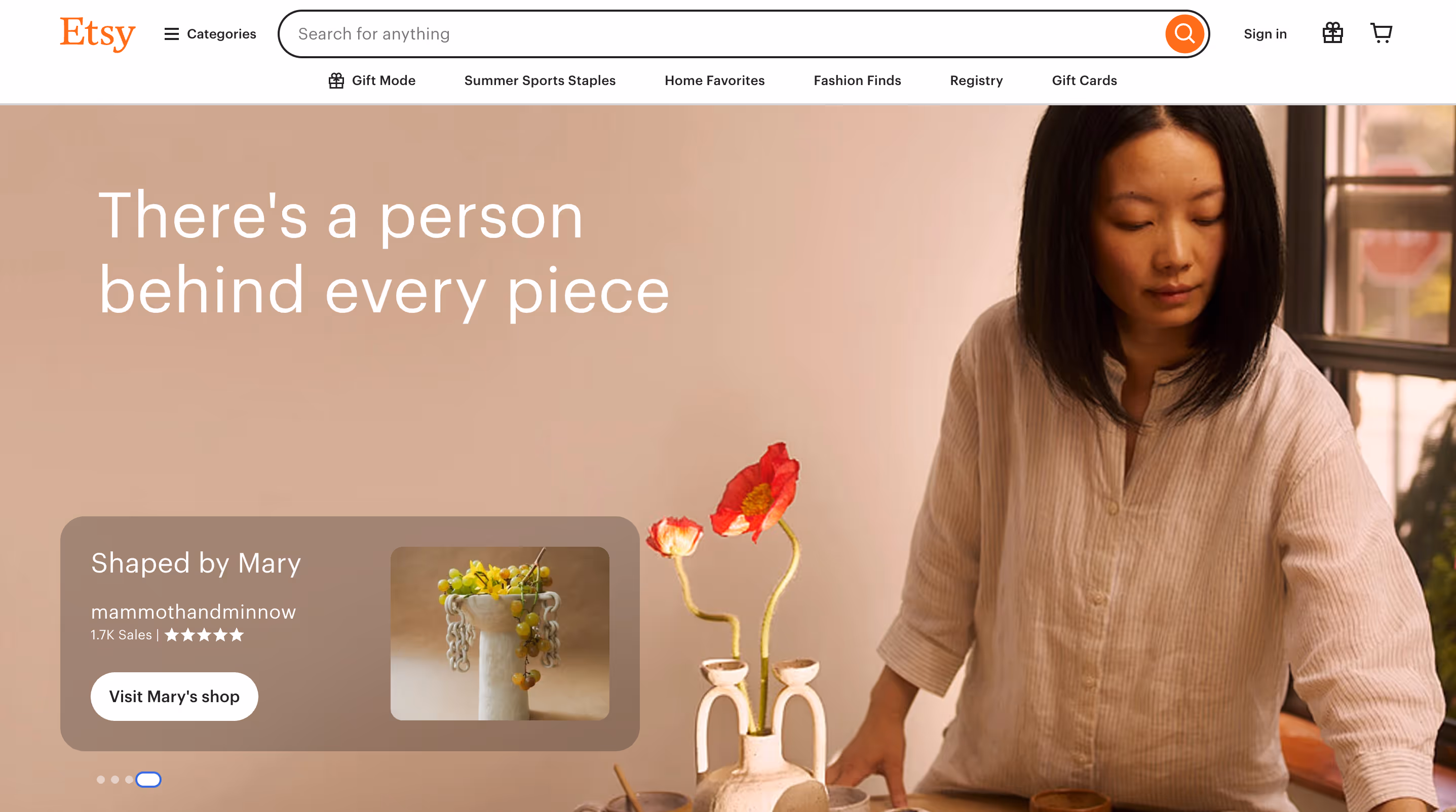
Brown, the color of earth and wood, embodies groundedness, reliability, and organic simplicity. This warm, natural hue evokes feelings of comfort, stability, and connection to the physical world. In the digital landscape, brown’s earthy character offers a powerful tool for brands seeking to convey authenticity, durability, and a return to basics while providing warmth and approachability.

In digital product design, brown’s versatility allows it to create environments that feel both rustic and sophisticated. Its ability to evoke a sense of history and craftsmanship makes it particularly effective in crafting user experiences that feel trustworthy, sustainable, and rooted in tradition.

Brown excels in:

  • Creating a sense of comfort: Its association with nature can make interfaces feel more welcoming and less sterile.
  • Conveying durability: Brown can suggest reliability and longevity, useful for productivity or archival apps.
  • Enhancing eco-friendliness: Its natural associations make it ideal for sustainability-focused or outdoor lifestyle apps.
  • Providing visual warmth: Brown can soften harsh digital environments, reducing eye strain.
  • Evoking nostalgia: Useful for vintage-inspired designs or platforms dealing with history and heritage.

Etsy’s use of rich brown tones brings warmth and authenticity to its digital interface, fostering a sense of discovery and connection with handmade treasures. This deliberate selection distinguishes Etsy and elevates online shopping to a worldwide marketplace of individual craftsmen.

Gray

Mac dock showing icons for various applications including Finder, Mail, Calendar, Safari, Chrome, Slack, Zoom, and App Store.

Gray, the perfect balance between black and white, embodies neutrality, subtlety, and sophistication. This versatile hue conveys a sense of practicality and stability while also evoking feelings of elegance and maturity. In the digital landscape, gray’s nuanced nature offers a powerful tool for brands aiming to project reliability, professionalism, and timeless design, though it can also risk evoking feelings of detachment or melancholy if not used thoughtfully.

In digital product design, gray’s adaptability allows it to create a wide range of moods and atmospheres. Its ability to recede into the background or step forward as a focal point makes it particularly effective in crafting user experiences that feel polished, balanced, and user-friendly.

Gray excels in:

  • Creating visual hierarchy: Its various shades can guide users’ attention subtly through an interface.
  • Enhancing readability: Light gray backgrounds can reduce eye strain without the starkness of pure white.
  • Conveying professionalism: Gray is often associated with seriousness and competence, ideal for business-oriented apps.
  • Balancing vibrant colors: It can serve as a neutral backdrop, allowing other colors to pop.
  • Evoking calmness: Certain shades of gray can create a soothing, distraction-free environment.

Gray infuses digital interfaces with understated elegance and functionality. Apple’s macOS exemplifies this, blending minimalism with user-centric design. It fosters focus, boosts productivity, and elevates the operating system’s professional feel. This thoughtful choice transforms daily computing into a streamlined, almost zen-like experience. Through gray, Apple crafts a visual ecosystem where technology and sophistication coexist. This isn’t just any gray—it’s the perfect backdrop for your digital life, letting your content shine while fading into the background. Apple’s strategic use of gray captures the allure of clean, uncluttered design. It’s the silent helper that makes using your Mac a joy, day in and day out, embodying Apple’s commitment to intuitive, elegant user interaction.

Multicolor

Colorful 3D Copilot logo with gradient ribbons on pink background.

Multicolor schemes embrace the full spectrum of hues, creating vibrant, dynamic, and eye-catching designs. This approach embodies diversity, inclusivity, and a celebration of variety. In the digital landscape, multicolor palettes offer a powerful tool for brands seeking to convey playfulness, creativity, and a wide-ranging appeal that speaks to multiple audiences or services.

In digital product design, multicolor schemes allow for creative expression and visual storytelling. Their ability to evoke a range of emotions and associations makes them particularly effective in crafting user experiences that feel energetic, inclusive, and engaging across diverse user groups.

Multicolor excels in:

  • Capturing attention: The variety of colors can make interfaces stand out in a crowded digital space.
  • Representing diversity: Useful for platforms that cater to a wide range of users or services.
  • Enhancing brand recognition: A distinct multicolor scheme can become a strong brand identifier.
  • Creating visual interest: Multiple colors can guide users through different sections or features of an app.
  • Evoking positivity: Bright, varied colors often elicit feelings of happiness and excitement.

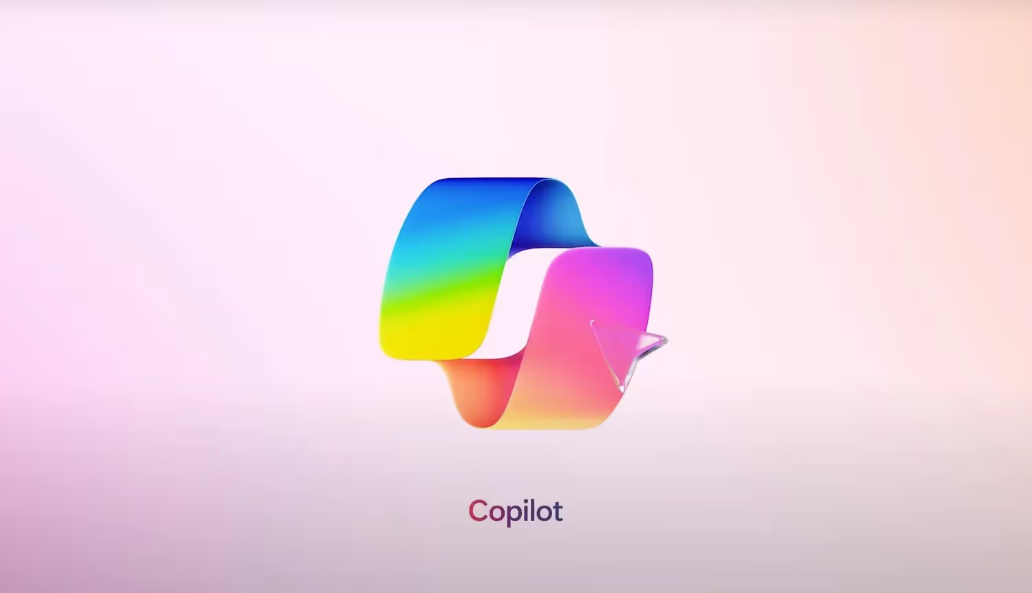
When used thoughtfully, multicolor palettes bring digital interfaces to life, as Microsoft’s Copilot icon demonstrates. The vibrant colors signify the diverse range of capabilities Copilot offers, fostering creativity and adaptability. Copilot redefines the computing experience, offering an intelligent and ever-evolving journey through its multicolor strategy.

Battle of the Brands: Industry Examples

Color Psychology in the Music Industry: Spotify vs. SoundCloud

Spotify and SoundCloud logos: green circle with curves versus white cloud with soundwave.

SoundCloud’s fiery orange and Spotify’s vibrant green exemplify how color can define a brand’s digital identity and user experience.

While SoundCloud’s orange ignites excitement for musical discovery and creation, Spotify’s green cultivates a sense of reliability and sophisticated curation. SoundCloud’s branding encourages users to dive into the unexpected, whereas Spotify’s suggests a more refined, tailored journey through the world of music.

Both colors serve their respective brands brilliantly. Orange amplifies SoundCloud’s identity as a platform for emerging talent and eclectic tastes, while green reinforces Spotify’s position as a polished, user-friendly service for everyday listening. These color choices not only differentiate the platforms visually but also subtly communicate their unique value propositions in the competitive landscape of music streaming.

Color Psychology in the Ride-Share Industry: Uber vs. Lyft

Uber and Lyft logos side by side. Uber logo in white on black background, Lyft logo in white on pink background, separated by 'vs' in pink.

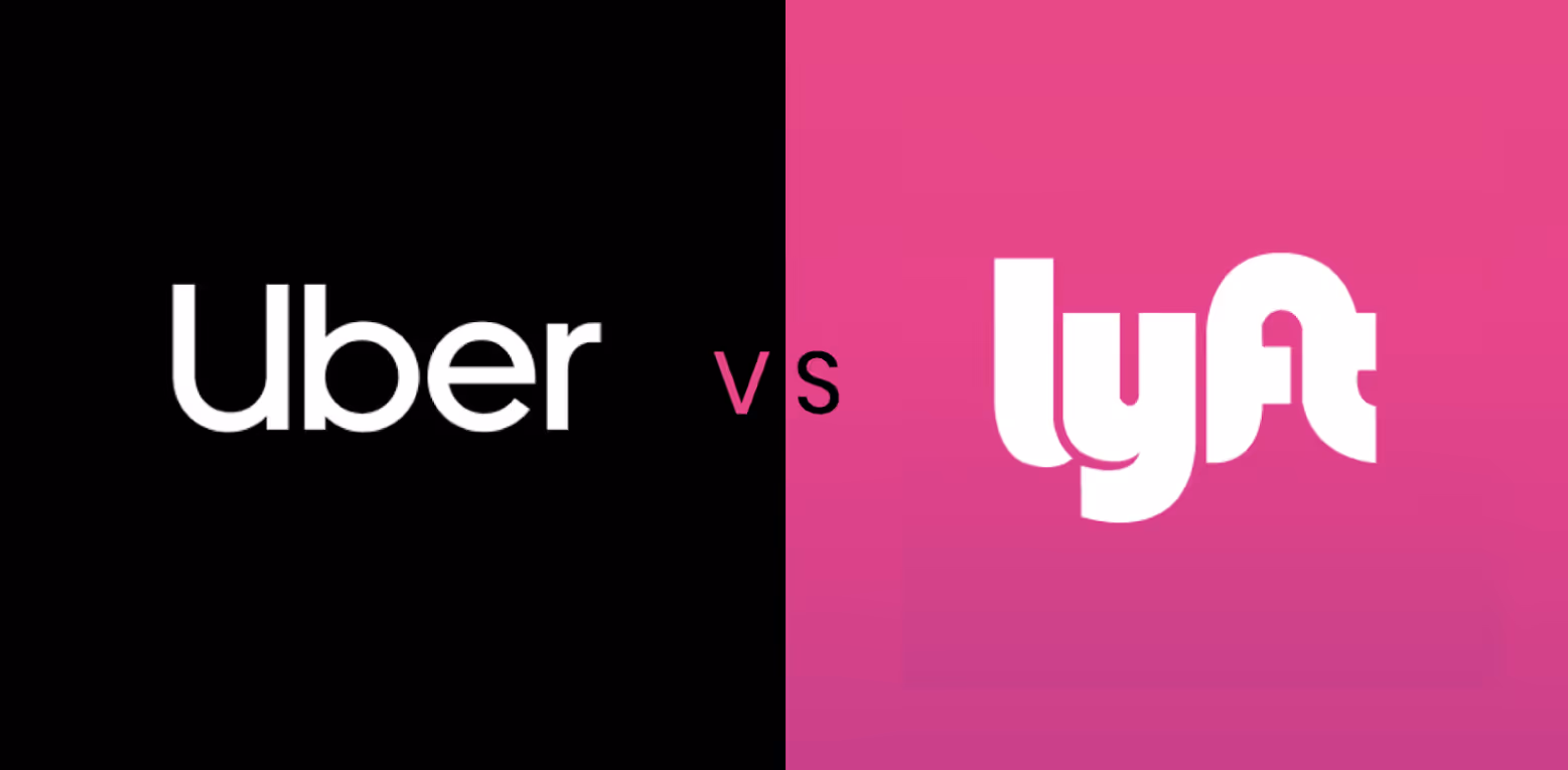
Uber’s sleek black and Lyft’s vibrant pink demonstrate how color can shape a brand’s digital identity and user perception in the ride-share industry.

While Uber’s black conveys a message of professionalism and reliability, Lyft’s pink communicates approachability and community. Uber’s branding encourages users to expect a seamless, business-like service, whereas Lyft’s suggests a more laid-back, socially conscious ride experience.

Both colors effectively serve their respective brands. Black reinforces Uber’s image as a sophisticated, efficient transportation solution, while pink amplifies Lyft’s identity as a friendly, community-oriented service. These color choices not only set the brands apart visually but also subtly communicate their distinct approaches to ride-sharing, helping to carve out unique positions in a competitive market.

Creating an Effective Color Palette for Digital Products

1. Understanding Color Theory

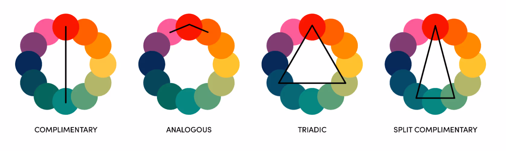
Before selecting colors, it’s crucial to understand basic color theory. This knowledge provides a solid foundation for creating harmonious color schemes:

  • Analogous: Colors adjacent on the color wheel (e.g., blue, blue-green, green) create a unified look.
  • Complementary: Colors opposite on the wheel (e.g., blue and orange) offer high contrast and visual impact.
  • Triadic: Three colors equally spaced on the wheel (e.g., red, yellow, blue) provide a vibrant, balanced scheme.
  • Monochromatic: Different shades and tints of a single color create a cohesive, sophisticated look.

Color wheel diagrams illustrating four color harmony schemes.

2. Selecting Your Palette

Start by choosing:

  • Primary Color: This should align with your brand identity and evoke the desired emotions. For example, blue for trust (Facebook) or red for excitement (Netflix).
  • Secondary Colors: 1-2 colors that complement your primary color, adding depth to your design.
  • Accent Colors contrast with your primary and secondary colors, making them perfect for call-to-action buttons or highlighting important information.

Pro Tip: Limit your palette to 3-5 colors to maintain visual harmony and avoid overwhelming users.

3. Employing Color Theory for Balance

Use color theory principles to create balanced, appealing designs:

  • 60-30-10 Rule: Use your primary color for 60% of the design, secondary for 30%, and accent for 10%.
  • Consider Color Psychology: Remember that colors evoke emotions. For instance, green can represent growth or nature, while purple often signifies luxury.

4. Ensuring Consistency Across Platforms

Develop a comprehensive brand guide that includes:

  • Color Palette: Primary, secondary, and accent colors with their hex codes.
  • Usage Guidelines: How and where each color should be used.
  • Examples: Show correct and incorrect color usage in various contexts.

Ensure this guide is shared across all teams and implemented consistently across all platforms—from your website and mobile app to social media profiles and marketing materials.

5. Leveraging Color Tools

Utilize these resources to refine your color choices:

  • Adobe Color: Offers color wheel and harmony rules to create and explore color schemes.
  • Coolors: Generates color palettes and allows you to adjust and lock colors.
  • Colorhunt: Provides curated color palettes for inspiration.
  • Paletton: Offers advanced color scheme designer with preview in website examples.

Additional Color Considerations for User-Centered Digital Products

Color Considerations: Culture

When designing for a global audience, it’s crucial to consider the cultural significance of colors:

  • Red: Symbolizes luck and prosperity in China, but danger or warning in Western cultures.
  • White: Associated with purity in Western cultures but with mourning in many Eastern cultures.
  • Green: Represents nature and environmental concerns in many cultures but is sacred in Islam and can represent infidelity in China.
  • Purple: Often linked to royalty in Western cultures but to mourning in Brazil.
  • Yellow: Signifies courage in Japan, but cowardice in some Western contexts.

Always research the cultural connotations of colors for your target audience. Consider conducting user research or consulting with cultural experts to ensure your color choices resonate positively across different cultures.

Color Considerations: Accessibility & Inclusivity

Ensuring your color choices are accessible to all users is essential for inclusive design:

  1. Color Contrast: Aim for a contrast ratio of at least 4.5:1 for normal text and 3:1 for large text against backgrounds
  2. Don’t Rely Solely on Color: Use additional visual cues (like icons or patterns) to convey information.
  3. Consider Color Blindness: Test your designs with color blindness simulators. 
  4. Customization Options: Consider allowing users to customize color schemes or offering a high-contrast mode.
  5. Text Overlays: Ensure text is legible over colored backgrounds or images.

Resources include ​​the W3C Web Accessibility Initiative (WAI) Guidelines, Colorblind Web Page Filter, and Web Aim’s Color Accessibility Tips and Tools.

Testing & Iterating Color Choices

Selecting the right colors for digital products is a dynamic process that combines creativity with data-driven decision-making. A/B testing allows you to objectively compare different color schemes by measuring key metrics like engagement and conversion rates. Tools like Optimizely can facilitate these tests.

User feedback, gathered through surveys or interviews (via UserTesting, for example), provides valuable insights into emotional responses to your color choices. Heat mapping tools like Hotjar help visualize user interactions, showing whether your colors effectively guide attention to key elements.

Analytics tools such as Google Analytics can track user behavior across different color schemes, helping identify effective combinations. Remember, color selection is iterative. Don’t hesitate to make gradual changes based on your findings, and consider seasonal adjustments to keep your design fresh.

Combining these methods and maintaining a willingness to evolve will ensure that your color choices effectively serve your brand and users in the ever-changing digital landscape.

The InspiringApps Brand Colors

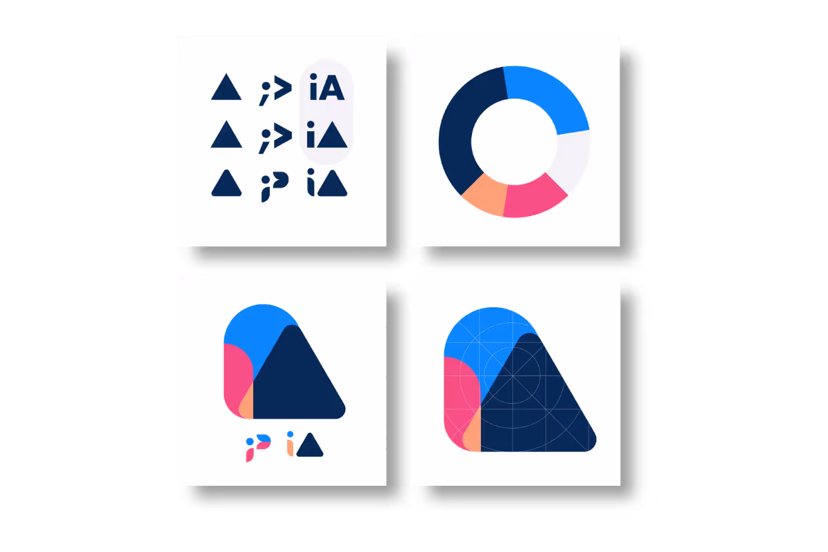
When InspiringApps rebranded in 2020, we employed color psychology for our own brand as the design team replaced the original logo’s prominent black, white, and primary colors with a fresh, unique color palette. The new palette features two blues as our primary colors, which ground the design visually and evoke the sincerity and professionalism at the heart of all we do. While accents of magenta and peach help to encapsulate the creative energy and passion our team brings to every project.

Read about our own rebranding process and our detailed design decisions here: https://www.inspiringapps.com/rebrand/

Conclusion: The Power of Color in Digital Product Design

Color is far more than just an aesthetic choice in digital product design—it’s a powerful tool that can shape user experiences, influence behaviors, and communicate brand values. From the energetic orange of SoundCloud to the sophisticated gray of Apple’s macOS, every color choice tells a story and evokes specific emotions.

As we’ve explored, selecting the right colors involves understanding color psychology, considering cultural nuances, ensuring accessibility, and aligning with your brand identity. It’s a process that requires both creativity and data-driven decision-making.

Remember, there’s no one-size-fits-all approach to color in digital design. What works for one brand may not work for another. The key is to understand your audience, test your choices, and be willing to iterate based on user feedback and performance data.

As you embark on your color selection journey, keep these key takeaways in mind:

  1. Use color purposefully to guide user attention and actions.
  2. Consider the emotional and cultural implications of your color choices.
  3. Ensure your color palette is accessible to all users.
  4. Maintain consistency across all touchpoints for strong brand recognition.
  5. Don’t be afraid to test and refine your color strategy over time.

By thoughtfully applying color psychology principles, you can create digital products that not only look great but also resonate deeply with your users, enhancing their experience and driving engagement.

Need more inspiration?

You know it when you see it: design that delivers. The best digital products are intuitive, engaging, and one of a kind. See award-winning examples and more in our branding showcase.
Recent Posts

Digital Product Design

Key UX Design Trends for 2024: Exploring the Future of Digital Experiences

As technology progresses exponentially, users’ needs and behaviors evolve as well. Continuous innovation in areas like AI, personalization, and accessibility are driving meaningful changes in UX design trends and digital experiences. In a recent article featured on Built In, InspiringApps’ UI/UX Designer, Becca Collins, provided an inside look at how we build customer-centric trends at the heart of our UI/UX design. Customer-Centric: The focus for 2024 and beyond will center around creating more straightforward, secure, and personalized access for all through a customer-centric mindset.  Personalized: Designers can gain unprecedented insight into individual preferences and behaviors by leveraging data and emerging techniques like conversational interfaces to tailor interactions anticipating user needs. Inclusive: At the same time, inclusive practices and intuitive interfaces will help break down barriers so people of all abilities can engage fully with the digital world.  Empowering: This confluence of UX design trends presents an exciting opportunity for user experience to advance in a way that places proper user understanding, empowerment, and delight at the forefront of design. Designers take note—here are the latest trends in UX design. The Rise of Customer-Centric UX Design Trends In today’s digital landscape, users have come to expect nothing less than seamless and highly personalized experiences across all platforms. As a result, UI, UX, and CX as whole have shifted towards prioritizing the user’s needs, preferences, and behavior and using user feedback to iterate and improve the experience. With this philosophy, design exists mainly to help users navigate and use apps. In customer-centric UX design trends, the experience and the design are two sides of the same coin. When businesses understand and cater to these aspects, they can create engaging and satisfying interactions that leave a lasting impression. From intuitive interfaces to personalized recommendations, the focus is on delivering exceptional user experiences that foster loyalty and drive success. These UX design trends all contribute to the shift to customer-centric design. Here are a few that will make the most significant impact on UX design trends in 2024: Enhanced Personalization Through Data The personalization era is here, as we leverage user data and analyze behavioral patterns to create tailored interactions. Applying individuals’ preferences, data, interests, and needs, we can design experiences that resonate personally. Companies like Netflix and Spotify have taken this UX design trend to a new level, offering delightfully personal user experience at every step, driven behind the scenes by users. Advanced customization carefully crafts every interaction to meet users’ unique requirements and expectations, ultimately fostering deeper engagement and satisfaction. Security Meets Simplicity In today’s digital landscape, multi-factor authentication, biometrics, and encryption have emerged as invisible layers of protection. These advanced security measures seamlessly blend into our everyday lives, ensuring safety without compromising user experience. But in addition to keeping harmful agents out, security must be frictionless for app users. Individuals can confidently navigate the digital world by leveraging these cutting-edge technologies, knowing their sensitive information remains safeguarded from potential threats. Designing for All Inclusive design principles aim to ensure equitable access for diverse groups of users, regardless of their abilities, backgrounds, or preferences. Accessibility is more than an optional box to check. It’s the right thing to do for all consumers.  By considering various perspectives and incorporating inclusive design features—including alt text, high contrast and text size options, and imagery reflecting diversity and inclusion—designers can create products and experiences that are accessible to everyone, fostering a more inclusive and empowering digital environment. Accommodating the Aging Population Inclusive design principles ensure that technology remains accessible, engaging, and beneficial for individuals of all ages, creating a more inclusive digital world. As technology trickles down through all aspects of life, UX design is evolving to accommodate the aging population. Older adults may face unique challenges such as vision and hearing impairment, reduced dexterity, or cognitive changes, impacting their interaction with digital platforms. To create a seamless, no-friction user experience for them, designers must incorporate features like larger text sizes, high-contrast color schemes, and simplified navigation. Implementing assistive technologies such as text-to-speech and speech-to-text aids can significantly enhance the digital experience for the hearing and visually impaired.  Microinteractions That Delight Subtle cues and feedback are essential for enhancing functionality and providing moments of delight and discovery. These small but impactful details can guide users seamlessly through an experience, making it more intuitive and enjoyable. By incorporating these elements, we can create an interface that meets users’ needs and surprises and delights them along the way. Microinteractions are the secret sauce of user interfaces (UI). They are the small but powerful details that boost user engagement by offering instant feedback. From charming icons to delightful animations, these intricate elements inject life into your product, making it irresistibly appealing. Weaving Stories Through Experience Exploring the fascinating art of design narrative and storytelling goes beyond aesthetics and delves into emotional connections and deep engagement. By meticulously crafting seamless and captivating product journeys, designers have the power to create experiences that resonate with users on a profound level, leaving a lasting impact. Considering how we want users to feel when using our websites or apps is an integral part of storytelling through design. We can guide users toward specific actions by evoking emotions like joy, sadness, excitement, or grief through compelling copy and imagery. As we move forward, UX trends will continue to evolve and adapt to incorporate new technologies, enabling us to anticipate better and meet users’ needs, ultimately reshaping digital products to revolve around the human experience. By focusing on enhancing usability, accessibility, and overall user satisfaction, we can create digital experiences that truly resonate with people and make a positive impact on their lives. The Future of UX Design Trends As we continue to push the boundaries and push ourselves as designers, it’s crucial to consider different generations’ diverse needs and preferences. Whether it’s Baby Boomers who value ease of use or Gen Z who prioritize customization and personalization, understanding what matters most to each age group will be vital in creating successful digital products. Designers and developers should continue to observe, research, and learn from our users as we strive to create incredible designs that make a difference in people’s lives.

6 months ago

Digital Product Design

The App Design Process: Bringing Your Ideas to Market

App design is more than pretty colors and flashy animation—it’s the how and why of the app development process, deeply ingrained throughout the entire project. UI/UX designers work to create both a well-designed user experience and a beautiful interface. UI/UX designers and software developers work together to deliver your concept into a full-fledged, go-to-market digital product so your app is ready for launch. Developing code can seem like a concrete step, but how do you get your app’s design from concept to code? In this article, we’ll detail what you’ll need to do to transform ideas into user experiences, inject design theory and best practices, and deliver an app to market that delights the end user and meets your product goals. Stages in the App Design Process At its core, app design is about defining strategy, reviewing designs with increasing detail and interactivity, and working with experts who immerse themselves in your project—aligning your goals and the product’s user experience at every stage. Designers apply elements such as color, fonts, icons, illustration, animation, navigation, and brand design, through a proven process that makes it easy for you to achieve your goals: Strategy: Meeting Your App’s Business Objectives Through Design Wireframing: Illustrating How Your App Will Work High-Fidelity Designs: Previewing Your App Launch & Marketing: Bringing Your App to Users Read on for more details on each stage and how app design brings your ideas to fruition. 1. Strategy: Meeting Your App’s Business Objectives Through Design The strategy provides the plan to meet the business objectives of your app through design. Understanding your business, goals, and the desired end product is our very first objective and what guides our success, so our designers immerse ourselves in these areas. In discovery sessions, we work with you to identify your product vision and objectives. Through detailed research, discussion, and strategic analysis, we begin to define and visualize the end product.  Defining user experience requirements takes precedence from the very beginning of the app design process. To create the best design for your app, our designers work to fully understand what the end-to-end user experience should look like. To do this, we ask questions like these: What is the problem your app will solve? What functions will your app provide? Who are your app’s target users? What are users going to achieve through the app? What are their pain points? What motivates your users? What is important to them? How can we best serve users through design? Are there other products in this market space we should look at? Do you have brand or style guidelines already in place? We also research the competitive landscape to unearth how your app is situated in the market during this stage. And, through audience analysis, we research the goals of potential users in that context. Using information gathered from discovery sessions, competitor and audience analysis, and other relevant research, we are ready to start designing wireframes to validate the app’s information architecture and user flows, as discussed in the next stage. 2. Wireframing: Illustrating How Your App Will Work The term “wireframe” has a long history, originating from design in car modeling, stop-motion animation, and sculpture to then being referenced in computer-aided design and CGI animation. Similarly, the wireframe serves as a visual guide to the user journey in app design, illustrating how your app will work. Why is wireframing important? Think about it this way: If you were building a house, you wouldn’t want to invest time and money before understanding the blueprint. In the same way, a wireframe makes sense to design early in the process before investing time, money, and coding into the final product. Fidelity is another essential aspect of the design process. Like the term “wireframe,” the term “fidelity” is drawn from other historical uses—in this case, the music scene, where it refers to audio quality. With wireframes in app design, fidelity represents the amount of detail shown. As we design your app, there is a spectrum of detail that begins to take more and more shape in terms of the level of clarity and interactivity. We develop sketches and low-fidelity wireframes, which we will typically share with clients. These wireframes validate the app’s information architecture and user flows before getting into actual designs. For example, here’s a low-fidelity wireframe of a music app we developed: Clients review the low-fidelity wireframes, and we learn what high-level changes need to be made before moving to the next stage—high-fidelity wireframing. We then begin to consider UI elements—the color palette, visual hierarchy, and more that will start to come to life in your app design. 3. High-Fidelity Designs: Previewing Your App High-fidelity designs are an effective preview of your app, rendering details in full color. At this stage, we take the wireframes and bring them to life with a fully branded design.  Using the same app as above as an illustration, you can see the difference as we’ve moved from low-fidelity to high-fidelity: High-fidelity designs and, when needed, working prototypes, offer many advantages as the last step on the design detail spectrum. They provide an immersive experience that helps everyone truly grasp your app and provide a refined level of feedback to establish final agreement before coding begins. Seeing details in full color alongside architecture and flow, we can also improve the user experience. Here’s a summary of the purpose these high-fidelity designs serve: Render details in full color and branding Enable clients and other stakeholders like investors to grasp your app’s true appeal Provide a vehicle for comprehensive and precise feedback Establish a final consensus on deliverables before coding begins Enable assessment and improvement of user experience After a few rounds of revisions, we’ll create a digital style guide that we will hand off to developers who will build the app.  For example, here are some snapshots from the style guide for the music app: 4. Launch & Marketing: Bringing Your App to Users To download or not to download—that is the question. And with so many choices, delivering code isn’t enough to make a digital product successful. You want your app to be seen, which makes the launch and marketing stage equally crucial to all the others from a designer’s point of view. You can go beyond making a great first impression by marketing your app to attract, engage, and exceed your users’ expectations. While the strategies for marketing your app may vary, selling your app visually is a vital component of marketing it. App store landing pages feature your icon, screenshots, and video previews. The landing pages for our music app, for example, appeal to potential users by providing an attractive and informative visual summary of the app’s design and key features: App Design to the Finish Line Building a successful digital product requires more than development skills—design is a crucial consideration for any app project. At InspiringApps, our design skills elevate us from what other development agencies can provide. According to InspiringApps’ Art Director, Aaron Lea, what we’re creating is inspired and unique: Central to our app design methodology is our finish line, every time guarantee. InspiringApps pours our expertise into your app design and development from start to launch. As evidenced by our award-winning apps and our design-centric team, our app design process is integral to bringing your app to market. We guarantee your project will reach the finish line.

2 years ago

Blog Categories
App Marketing
Business & Strategy
Client Projects
Culture & Innovation
Digital Product Design
Digital Product Development
Digital Products
Events
InspiringApps News
Mobile Industry
Technology
Webinars