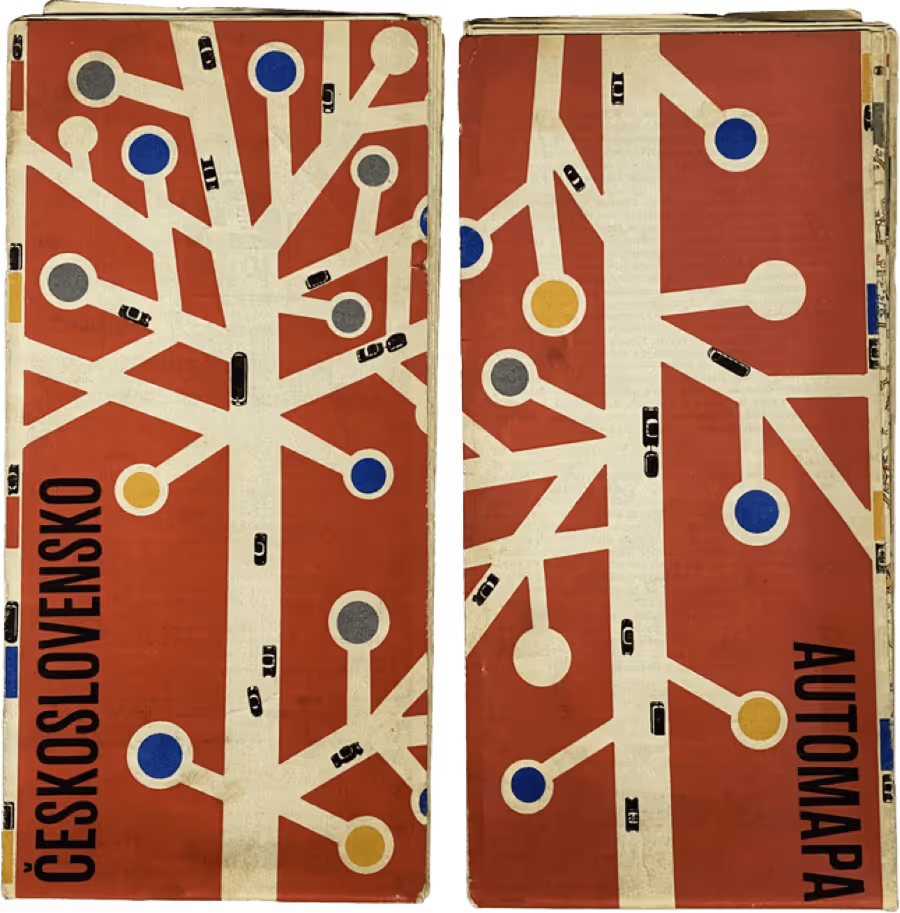
Over 18 years ago, InspiringApps was formed to craft inspiring custom software solutions. Focused on beautifully designed web and mobile apps that fulfill business needs, the company launched with a logo inspired by a mid-century Czechoslovakian street map—lines branching from a centerline, accented by multi-colored dots.

While InspiringApps grew and matured over nearly 15 years, the original logo remained unchanged. With intentional design always central to client work, the time came to apply that same purposeful approach to our own brand.
"The logo served us well initially, but it was hard to work with. The dark background made it difficult to use in artwork, and it didn't scale well for larger projects. It was time for a change," said Aaron Lea, Art Director.
The original design no longer captured what makes InspiringApps an industry leader. In early 2021, the design and marketing teams collaborated to create branding that reflected the company's evolution—the same process we bring to client projects.
Original Logo 2007 - 2021
The redesign centered on three core elements: our Boulder, Colorado roots, the code powering our solutions, and our fundamental values.
These translated into simplified shapes: a triangle representing Boulder's Flatirons, a semicolon and greater-than symbol for code. Combined, they form abstract "I" and "A" letterforms—a new mark embodying InspiringApps.


The design replaced prominent black, white, and primary colors with a distinctive palette. Two blues serve as primary colors, grounding the design and conveying the professionalism at our core. Magenta and peach accents capture the creative energy our team brings to every project.
"Some colors worked better than others according to their real estate in the design. We landed on two blues as primaries, followed by magenta and white. Peach makes an excellent accent—in moderation," said Aaron.
The new logo reflects InspiringApps' collaborative nature, combining UI/UX and marketing expertise. The team worked remotely through shared Adobe XD artboards, discussing and refining elements in real-time—leveraging technology for a smoother, more effective process.
New logo 2021
The team developed comprehensive iconography implementing core values—inclusivity, commitment, respect, empathy, and integrity—alongside coding symbols and platform icons for desktop, phone, tablet, and IoT.
Our brand identity reflects who we are and how we work—intentional, strategic, and focused on what matters. We bring this same approach to every client project.
From brand strategy to product design and development, we bring the same intentional approach to every client engagement. Explore our full range of services.
Explore our servicesWe help brands thrive in the digital world.
Inspired Where We Are—Our team of experts is 100% US-based, delivering user-inspired digital products from Boulder and beyond.