Dec 2021

Editor’s Note: This article reframes our previous “How To Use Color To Improve Usability” post, updated for April 2025 to reflect the current understanding of inclusive design principles.
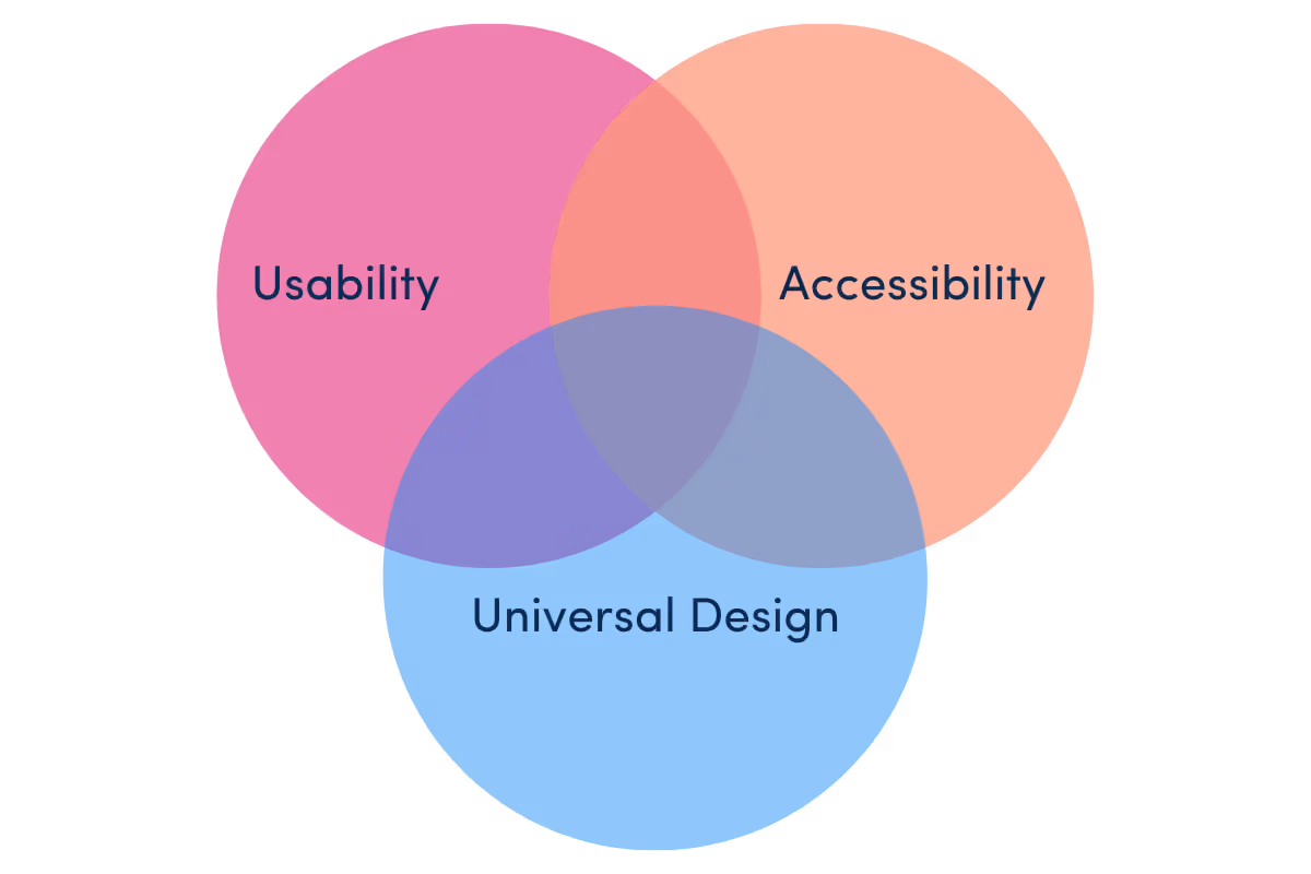
Why do some color palettes just work while others fall flat? The difference lies at the intersection of form and function.
Color shapes how we feel and where we look. But effective color design balances three key principles:
These aren’t separate constraints but complementary lenses that create experiences that look great and work better for everyone.
Usability applies color to create intuitive hierarchy, guiding attention, basic readability, and clear interaction patterns.
Usability focuses on designing for effectiveness, efficiency, and satisfaction for intended users under specified conditions. When applied to color, traditional usability principles emphasize:
These usability-focused approaches primarily optimize for the “typical” user experience, making interfaces intuitive and efficient under standard conditions.
Accessibility transforms subjective “good design” principles into objective, measurable criteria that ensure digital products remain usable across diverse abilities.
Accessibility, often guided by the foundational POUR principles (Perceivable, Operable, Understandable, Robust), shifts the focus to ensuring equivalent experiences specifically for users with disabilities. For color, accessibility introduces formal requirements:
Accessibility mandates objective criteria for color: meeting contrast ratios, using non-color indicators, providing redundant cues, and systematic testing. Meeting current Web Content Accessibility Guidelines (WCAG 2.1 Level AA) standards of 4.5:1 for normal text and 3:1 for large text (typically 18pt or 14pt bold). Striving for the enhanced Level AAA standard (7:1 for normal, 4.5:1 for large text) provides even better readability for more users.
Universal design broadens the scope: ensuring color choices are perceptible in all conditions, equitable across vision types, and intuitively understood.
Universal design (UD) takes a more holistic approach, proactively designing products and environments to be usable by the widest possible range of people in the broadest range of situations without requiring adaptation or specialized design.
When applied to color, universal design principles include:
Universal design incorporates “color universal design” (CUD) principles, such as selecting robust color palettes, integrating shape/line/pattern alongside color, and clearly labeling colors when necessary.
Accessibility and usability aren’t separate domains but interconnected frameworks that build upon each other. A product inaccessible to millions of potential users fails the basic usability test of effectiveness for intended users.
If significant user groups (like people with disabilities) cannot effectively use a product due to color barriers, the product isn’t truly usable. Rather than viewing accessibility as simply a subset of usability or a “nice to have,” it’s often foundational to genuine usability.
Universal design (UD) inherently incorporates accessibility principles but aims higher, seeking solutions that work for everyone from the start. Instead of treating disability as a special case requiring accommodation, UD recognizes the spectrum of human abilities and designs for that diversity by default, often naturally fulfilling accessibility requirements.
Inclusive design, a closely related methodology, similarly embraces the full spectrum of human diversity, often with a strong emphasis on co-designing solutions with users representing that diversity.
Key takeaway: Designing accessibly often creates universal usability benefits, like high contrast improving readability for everyone in bright light.

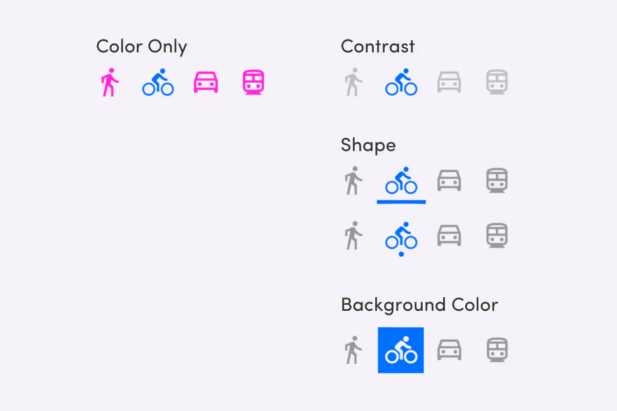
Many color considerations initially driven by accessibility concerns benefit all users, illustrating the “design for one, benefit many” principle often seen in inclusive practices:
One element, three perspectives: usability, accessibility, and universal design analyze color choices differently. Let’s analyze common color usage patterns through the lens of each framework.


The progression from usability to accessibility to universal design shifts color from tactical choice to strategic inclusion:
While understanding these distinctions helps clarify design objectives, aiming for universal design principles or embracing an inclusive design methodology, from the start, often creates the most effective path to digital products that are accessible, usable, and delightful for the most significant number of people.
Rather than treating these as separate concerns (“we need to add accessibility now”), a unified approach to color in digital design can satisfy all three frameworks simultaneously, creating products that truly work for everyone.
A good starting point is to always check your primary calls-to-action for WCAG-compliant color contrast.
Want to see how strategic color choices elevate real digital products? Explore bold, intuitive, and accessible color in work we’ve delivered for clients like Fidelity National Financial, Movie Pear, and Empath.
Download our branding showcase
We help brands thrive in the digital world.
Inspired Where We Are—Our team of experts is 100% US-based, delivering user-inspired digital products from Boulder and beyond.